I design brands, products, and the systems that hold them together. Built design functions and teams from scratch. Shipped across fintech, proptech, and SaaS.
United Capital
2026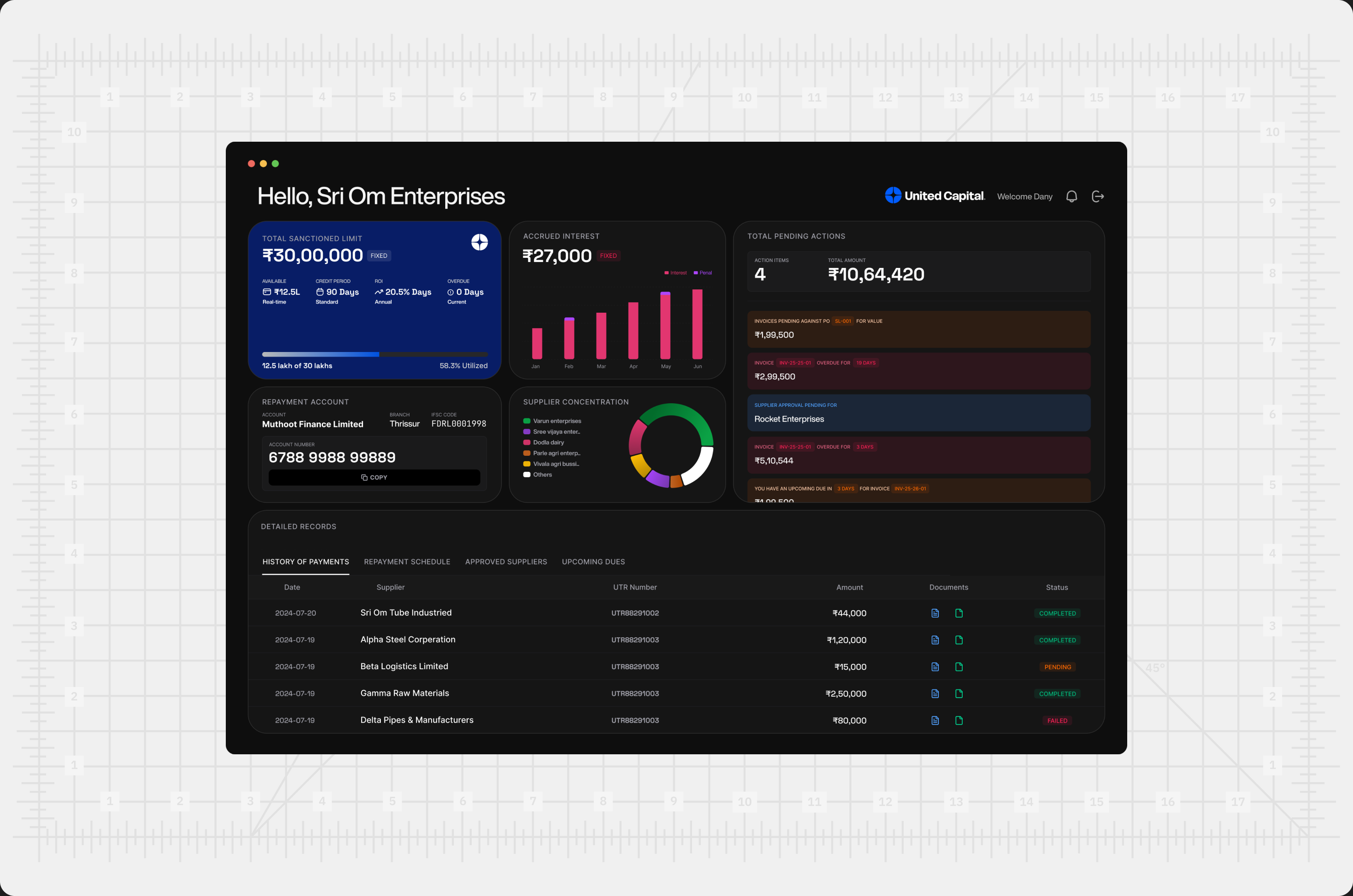
United Capital was already working when they brought me in. Monthly transactions approaching ₹10 Cr, demand growing, vision clear. What wasn't scaling was everything underneath — customer communication across WhatsApp groups, invoices moving through manual handoffs, financial calculations living in Excel, verified by a second person because nobody trusted the first number enough to act on it alone. I came in at the scoping session and stayed through final delivery. Owned the brand, the product, and everything in between.
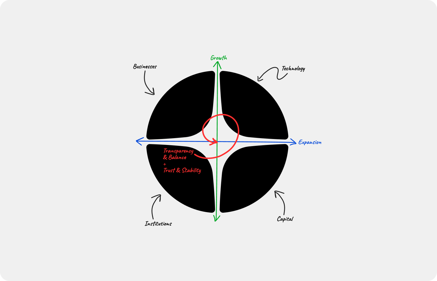
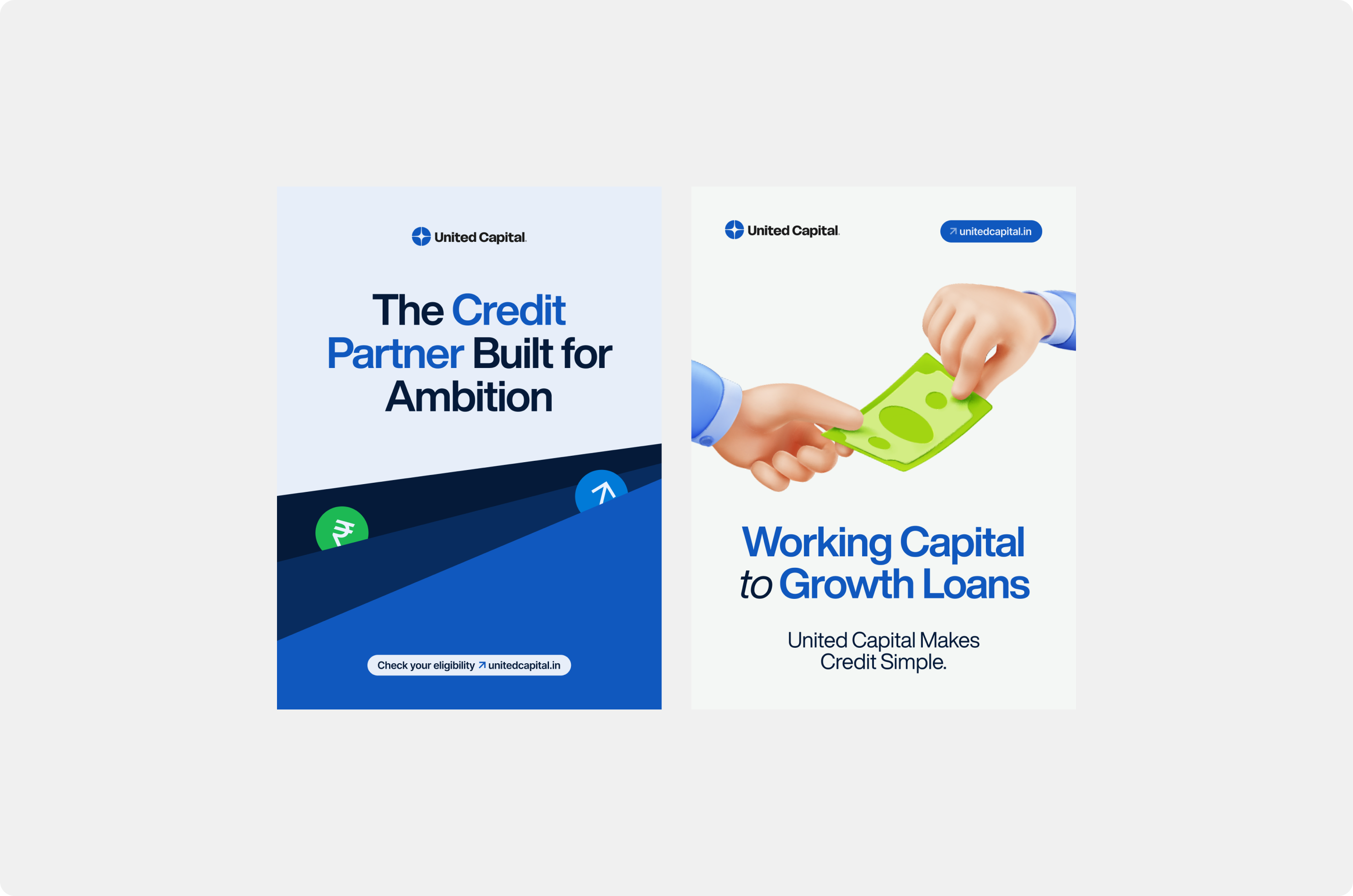
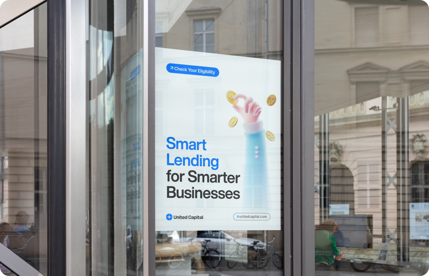
Before the first screen, I needed to know what UC was actually saying. Not a consumer brand. Not aspiration. Reliability — to businesses under pressure and to the lenders who needed to trust them.
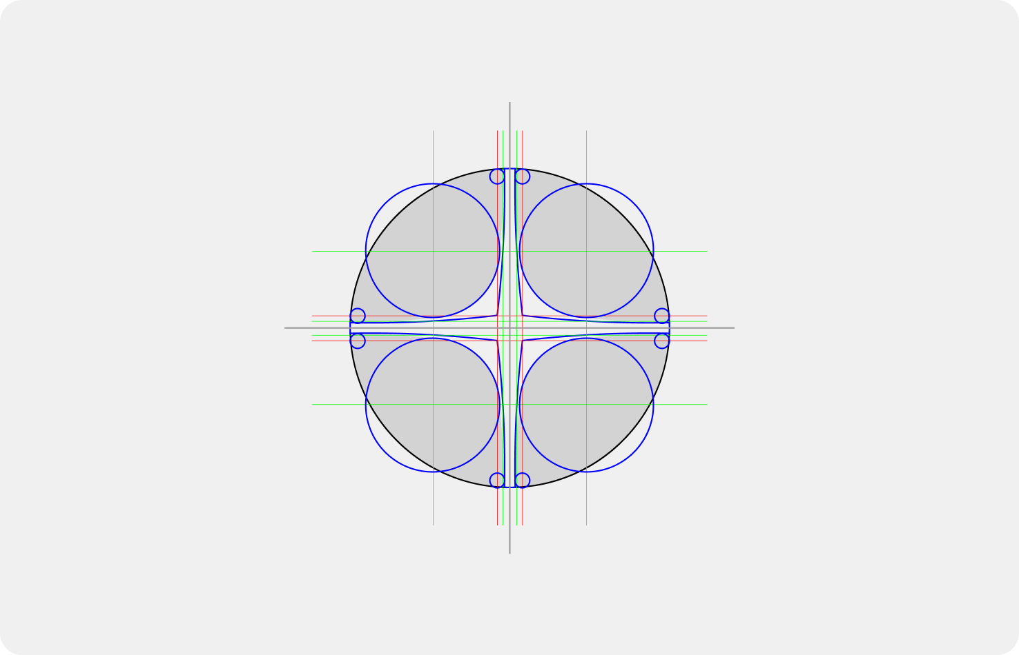
The mark came from that constraint. Four forms converging at a center point — businesses, institutions, technology, lenders — meeting in one place. Tight, symmetrical geometry that holds at icon size and doesn't soften at scale.
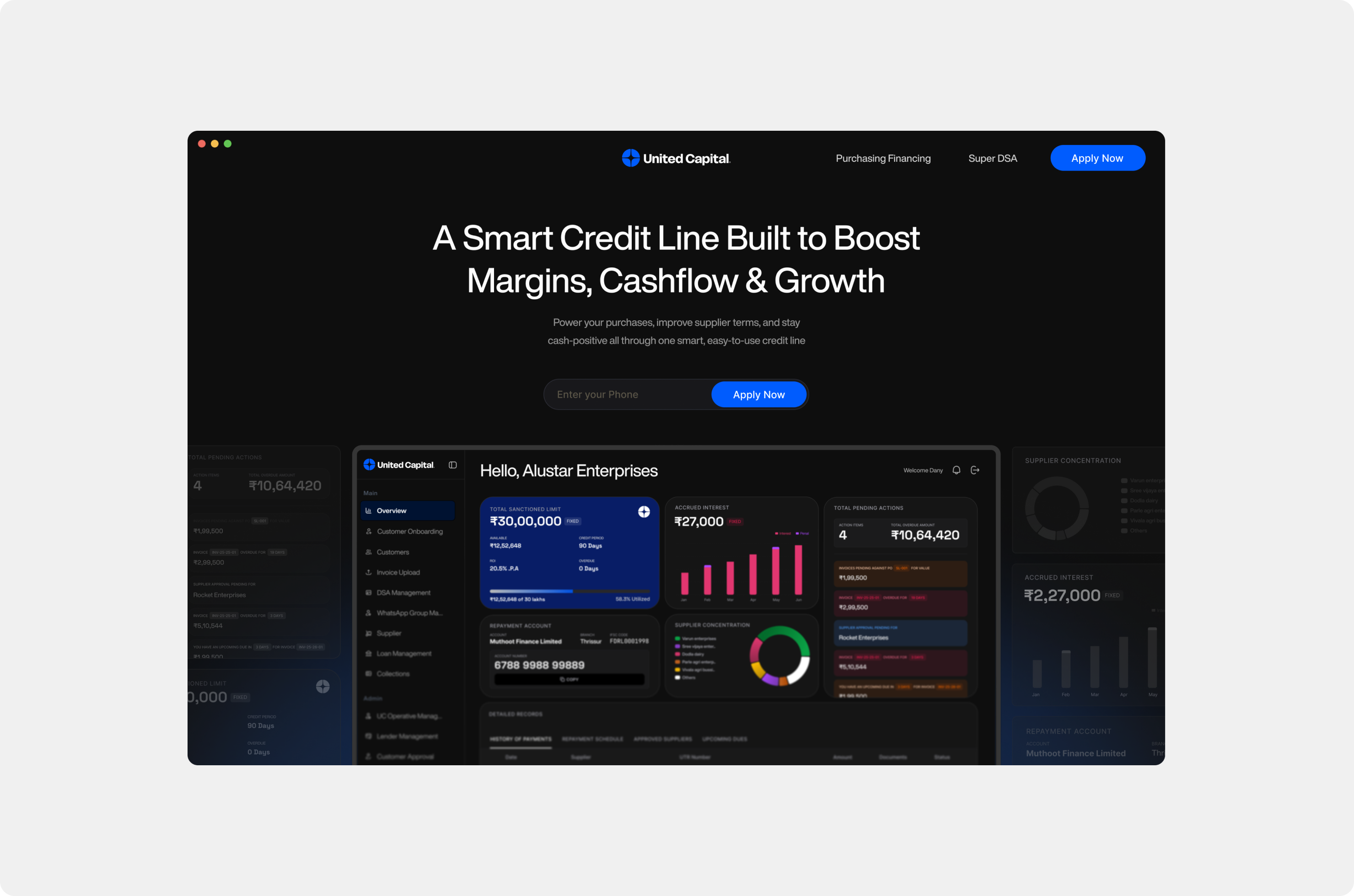
Colour was a deliberate rejection. Fintech defaults to blue. I didn't reject it — I stripped it of any softness. Electric blue against pure black and neutral grey. No warmth. The system had to work in a lender-facing pitch deck and on a WhatsApp message thumbnail. Three colour directions went into full application before one was chosen. The experimental direction — deep teal, mint-green, harder edge — is still the one I think about.
Helvetica Now Display for brand, Inter for product. One speaks. The other informs.

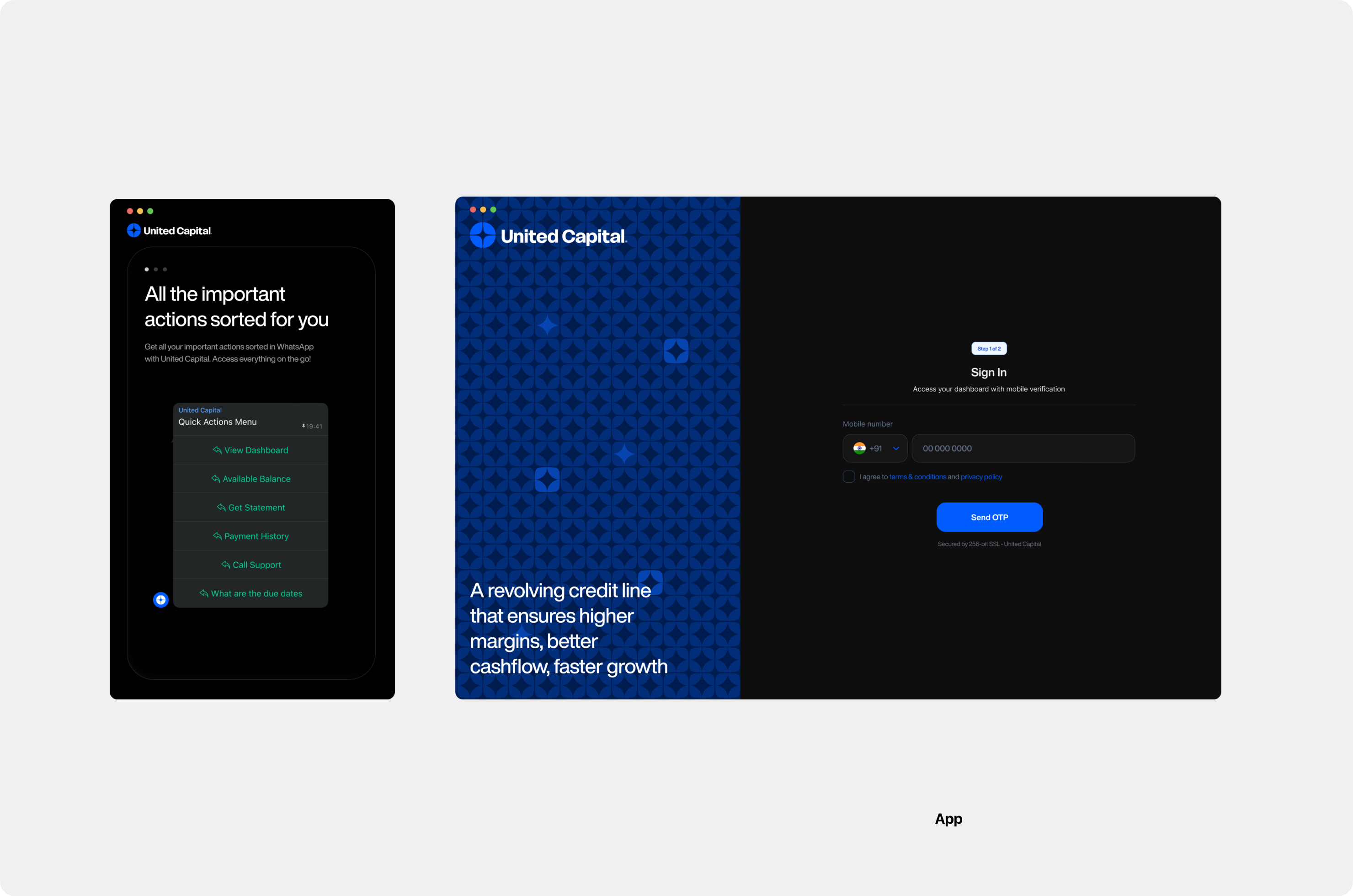
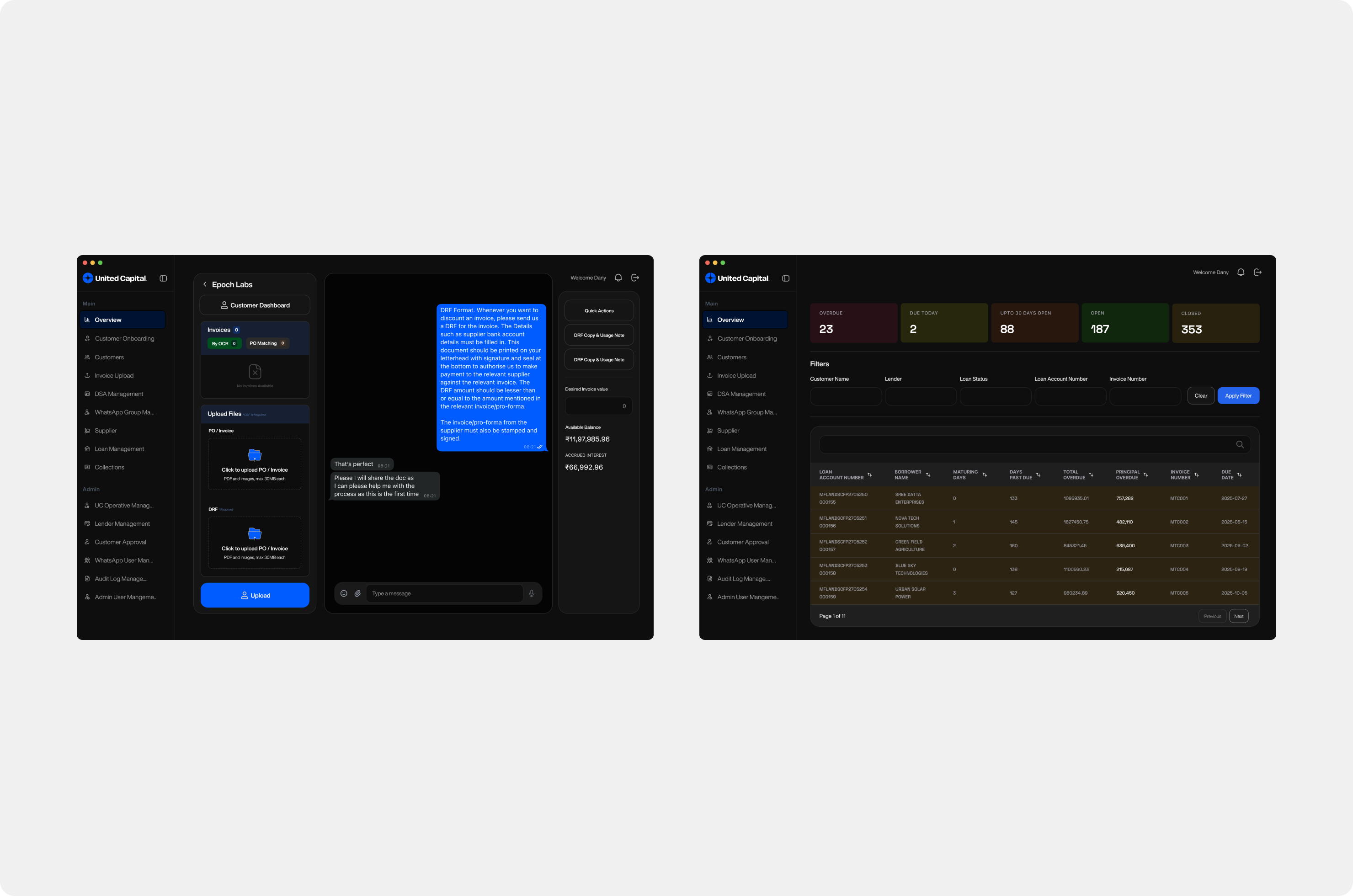
Discovery came before design. I mapped the entire operation — five user types, every handoff, every calculation — before touching a screen. What I found: a financial calculation engine that existed only in spreadsheets and in people's heads, a customer base that lived on WhatsApp and wasn't going to move, and role-based access requirements that were as much about compliance as UX.
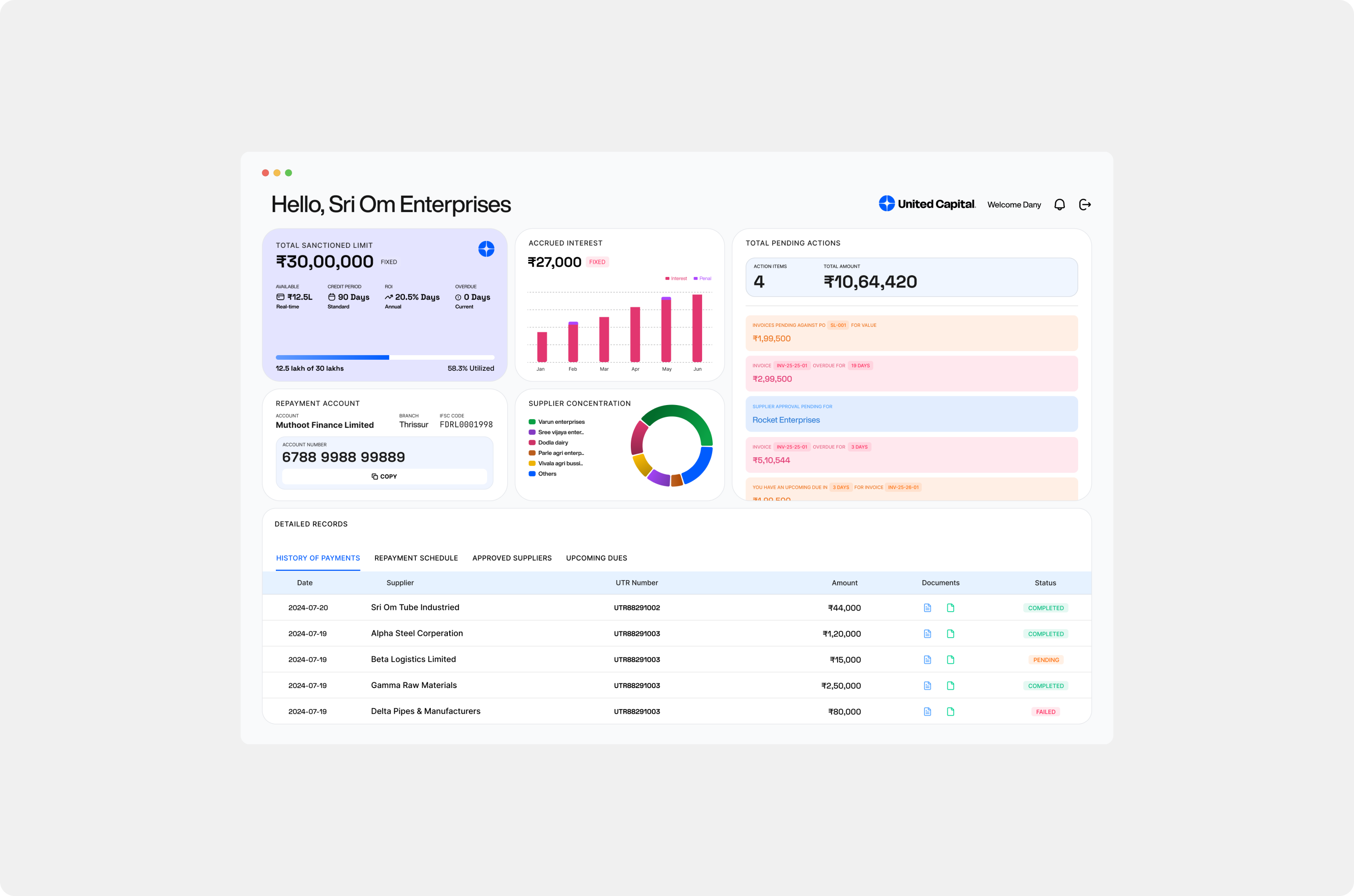
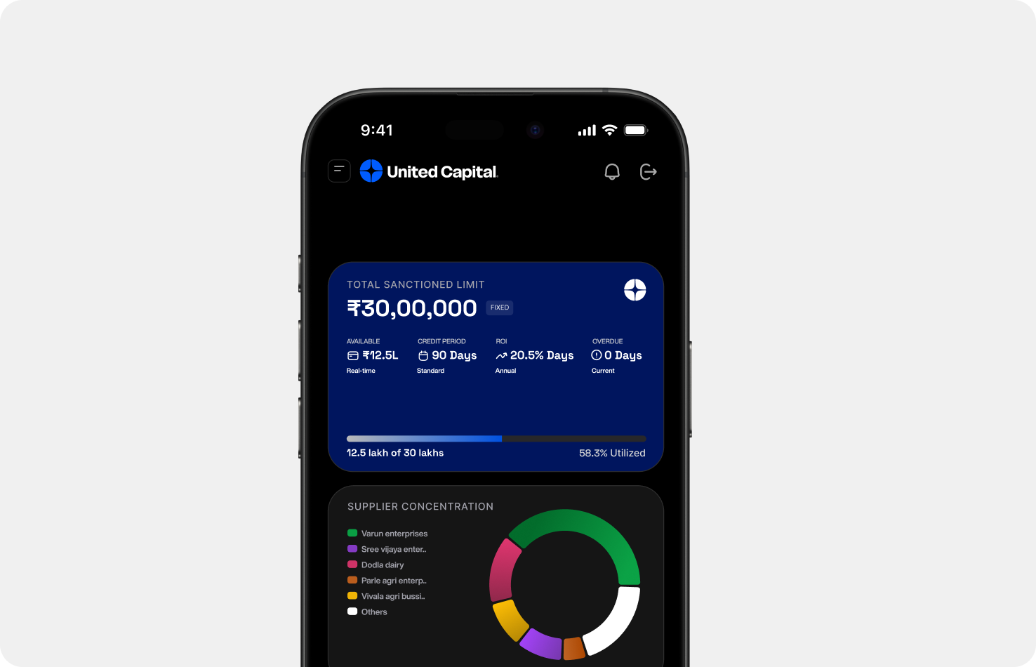
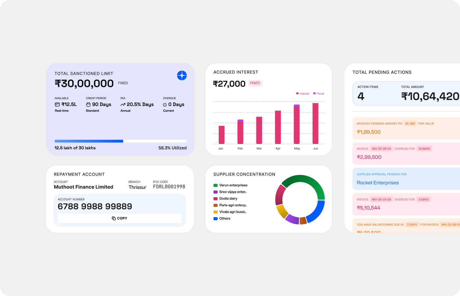
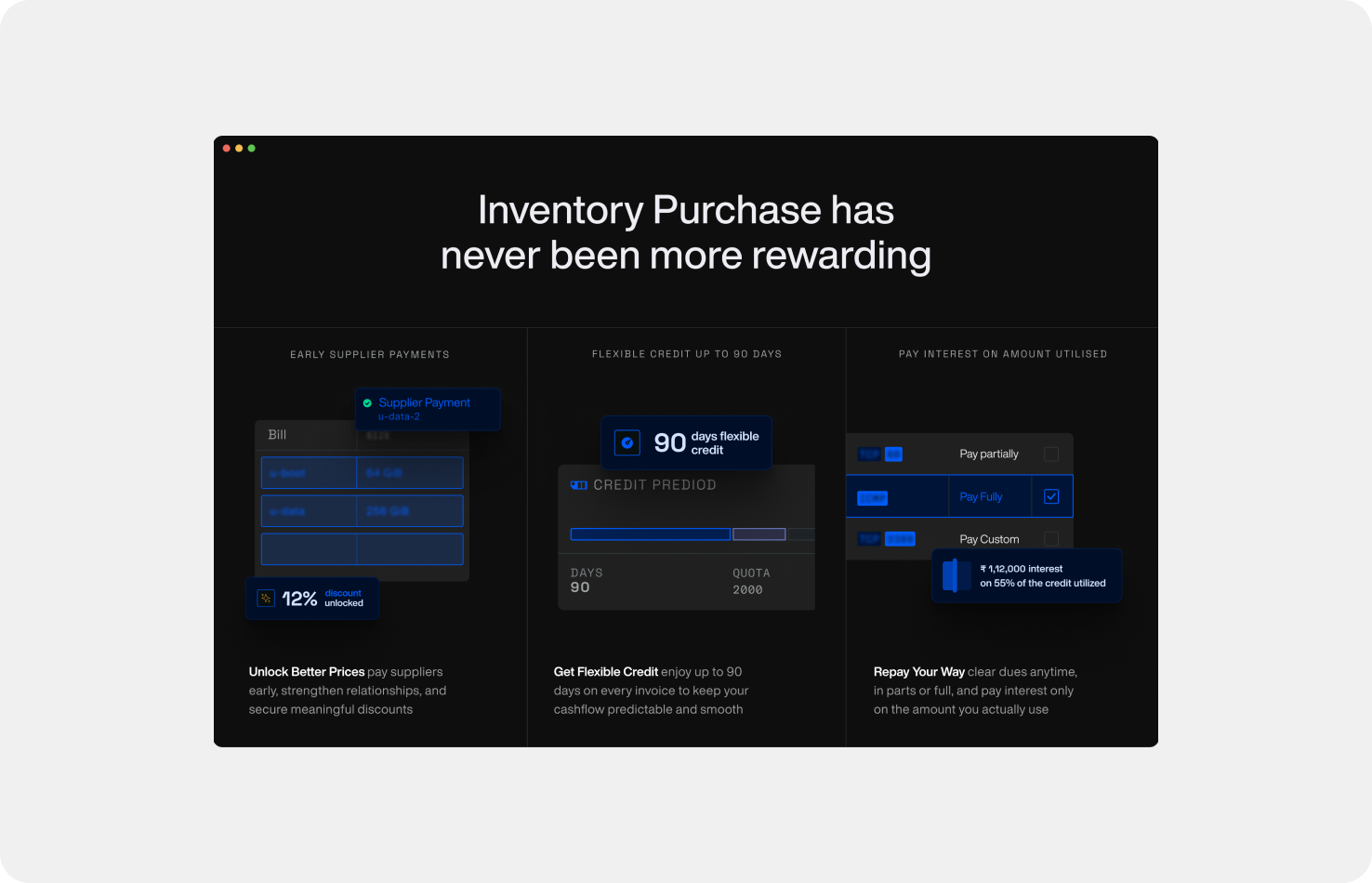
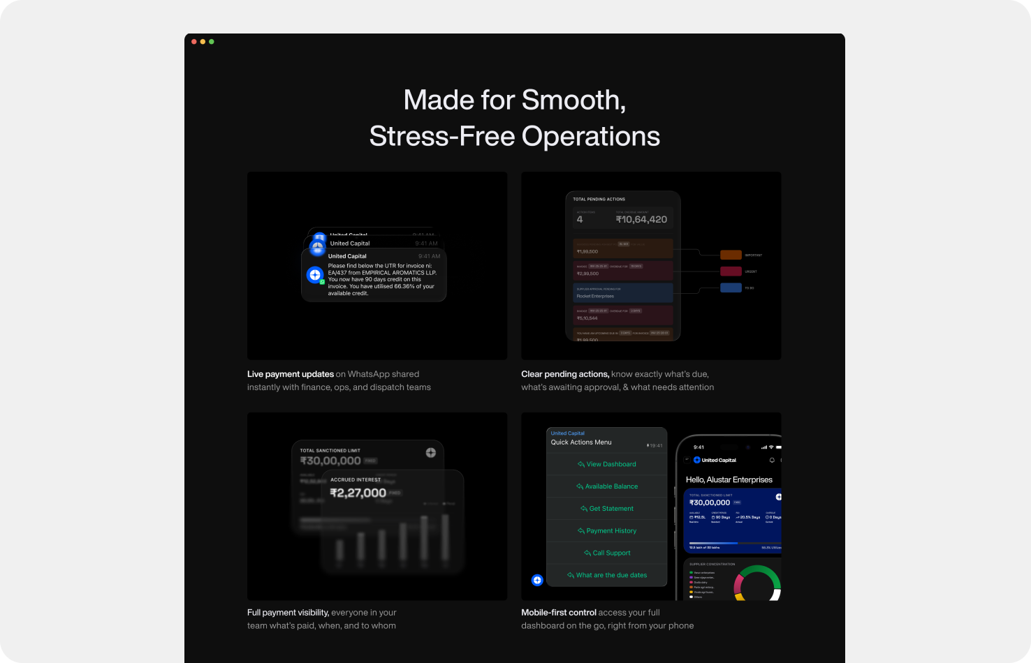
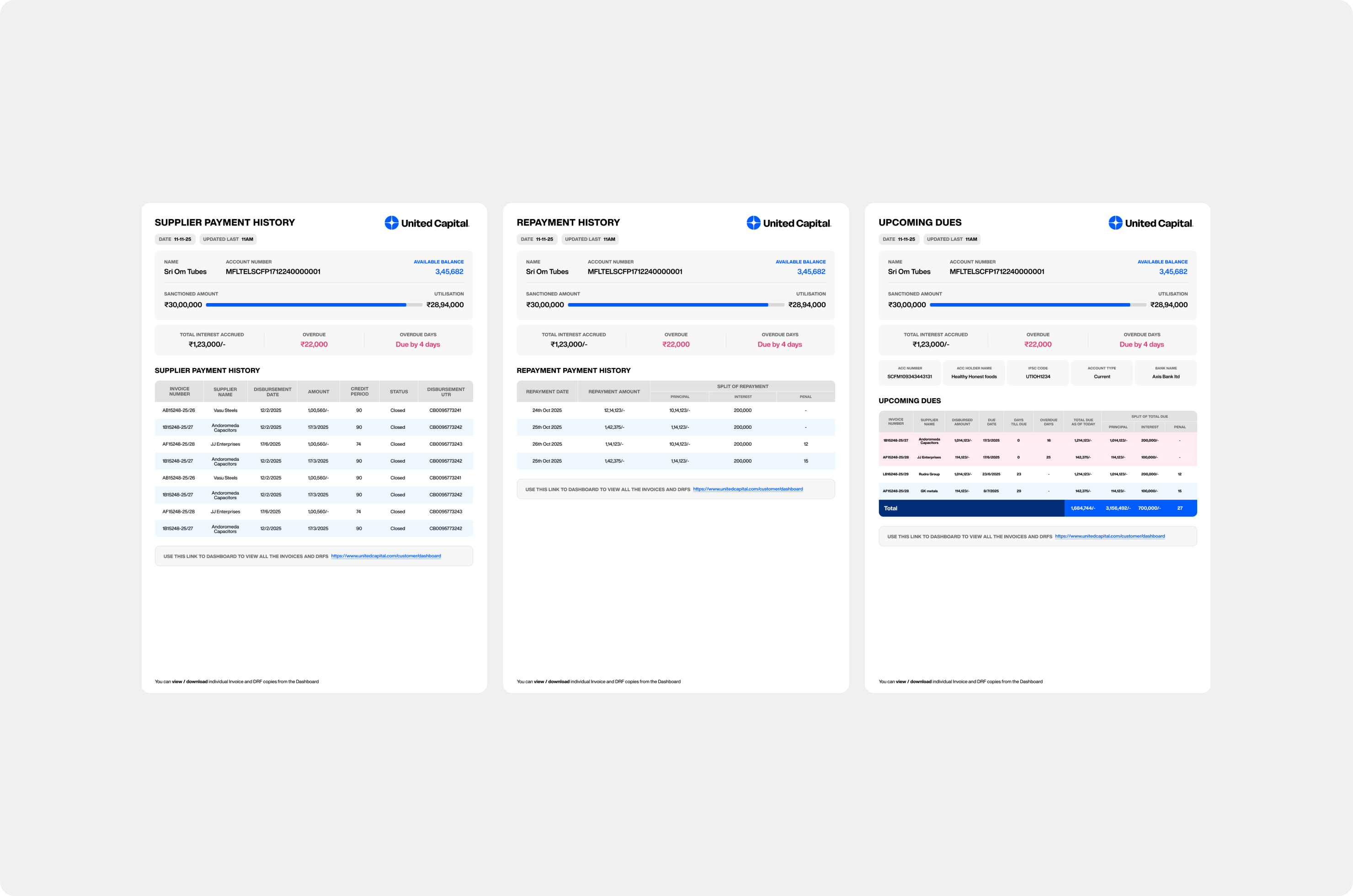
The build had three pieces. A WhatsApp operations console that brought structure to the operator side without changing anything on the customer side — their experience stayed identical, the operator's went from chaos to structure. A financial calculation engine that replaced forty to fifty hours of weekly manual work — interest accruals, lender margins, DSA payouts, all automated, all trusted. And a single platform holding all five stakeholder groups: customers, operations, accounts, admins, and lenders working from the same source of truth.
For the accounts team the shift was from producing numbers to trusting them. For operations, from reactive coordination to structured management. For leadership, from assembled reports to real-time visibility.
UC came in running a ₹10 Cr business on WhatsApp and Excel. The brand, the product, and the infrastructure to run a ₹100 Cr one — that's what we left them with.